
Lebara Mobile
Led the global omnichannel digital transformation of a telecommunications company, overseeing service design, design systems/UI kits, and product & UX/UI design.
Lebara is a telecommunications company providing services using the mobile virtual network operator (MVNO) business model in the United Kingdom, France, Denmark, the Netherlands, Germany, Saudi Arabia, Spain, Switzerland and Australia. Runs on Vodafone network in the UK.
I worked with
C-level, PMs, BAs and Developers
I have used
Sketch, Figma, Miro, ProtoPie, Analytics
Time scale
1-2 years to finish both projects
Design Team
Led a team of 7 in 2019 & Led a team of 14 in 2022
I have collaborated with Lebara on three separate occasions on a contract basis.
In 2018, 2020 & 2022-23
Project : Digital Transformation (Omini channel, Web & App)
Rebranding and digitalizing the Lebara ecosystem
Overview
As a UX designer at Lebara, a global telecommunications company, I contributed to improving their services for international communities and migrant workers through the mobile virtual network operator business model.
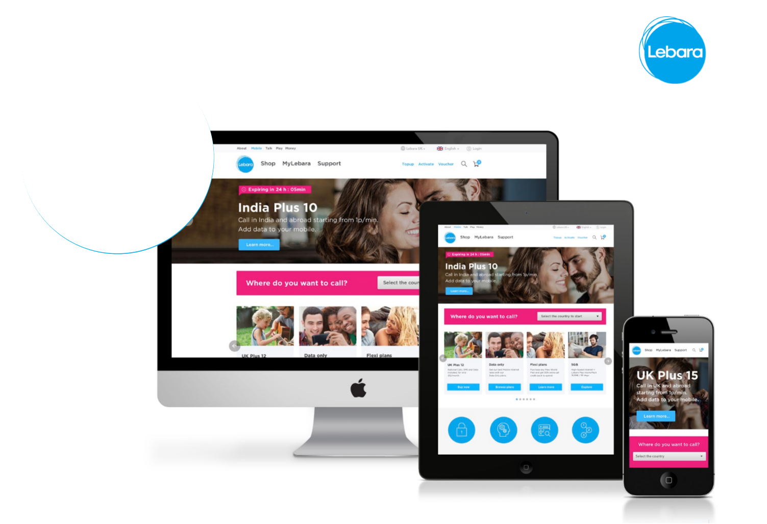
I played a key role in a successful rebranding effort, enhancing the business's internal and external aspects. This involved redesigning websites and mobile apps, including the current ones, and creating a new website using UX methodologies and research data for a better user experience.
My work included stakeholder interviews, research, journey mapping, data analysis, wireframing, prototyping, testing, and iterative improvements. I followed a user-centred approach in an Agile environment, collaborating with external agencies for branding and development. Additionally, I built and managed a product design team of seven in different countries.
-
1. Understanding the issue
2. Research and gather data
3. Prioritise the issues & work (problem statements)
4. Pitch the ideas to stakeholders
5. Wireframing the solution
6. Rapid prototyping
7. Test the concepts with the actual users and get feedback(Validating the designs)
8. Workshops and testing sessions when required
9. Iterate the wireframes quickly and test the prototypes
10. Check the data before and after to measure results.
-
We had a team of about 30, including engineers, testers front-end, back-end and full-stack developers based in London, India & Ukraine.
We also had a remote team based in Spain, Denmark, France, Netherlands & Germany of about 5-8 designers.
+ 1 Lead designer (that’s me)
-
I led the whole design process from start to finish. This included collecting information (through user testing, feedback, and analytics), coming up with and testing ideas, researching users, creating wireframes and prototypes, attending meetings with stakeholders, participating in sprint calls with the development team, and making improvements based on business goals and user feedback.
I facilitated a brainstorming workshop with the team to uncover issues and challenges experienced by individuals.
The session yielded the following revelations:
Outdated overall design
Navigation with 100 Nav items
Outdated checkout journeys
Limited Functionality
Not easy to reach customer service support
Dashboard with very limited information
Confusing user flows, No plan upgrade flow
Long SIM activation journeys
Outdated dashboard
Long TOP-UP user journeys.
Emails & letters are not visually appealing
Internal systems (HR & Backend) are outdated
The app doesn’t look like the web and limited functionality
Users are confused between Plans and Top-up’s.
Stage 1 : Understanding the issues
Stage 2 : Audit & Business goals alignments
Previous website These are the actionable and prioritised list of recommendations (gathered in workshops), with some of the main areas including:
Enhance Visual Appeal: Revitalize the design and typography to create a visually appealing and modern interface.
Optimize Checkout Journeys: Update and streamline the checkout journeys for improved user engagement and satisfaction.
Expand Functionality: Address limitations by enhancing the platform's functionality to meet user expectations.
Implement Customer Support: Introduce robust customer service support mechanisms to address user queries and concerns effectively.
Promotional Strategy: Incorporate promotional elements and banners to enhance user engagement and awareness.
Improve Information Architecture: Provide clear, concise, and comprehensive information to reduce user confusion and enhance understanding.
Streamline User Flow: Simplify and clarify user flows to improve the overall user experience and journey.
Accelerate SIM Activation: Shorten and optimize SIM activation journeys to minimize user effort and frustration.
Modernize Dashboard: Redesign the dashboard to align with contemporary design principles and user expectations.
Optimize TOP-UP Journey: Streamline and shorten the TOP-UP user journey for a more efficient and user-friendly experience.
Resolve Product & Service Design Issues: Address underlying issues affecting product and service designs to enhance usability and relevance.
Retention & Subscription journey improvement
In short, they want more numbers.
Less bounce rate on Websites & App.
Make it easy for Retention & self-service
Optimise Purchase journeys (Ordering a SIM with a plan, Monthly auto-renew, Top-ups, Roaming bundles & International passes etc)
Customise the Logged-in & Non-logged-in user experience on the experience
Convert offline users to Online as much as possible
Optimise new user onboarding on the app & activate their SIM quickly.
Highlight Rewards and Refer a friend journeys
Extend customer service hours and online chat streams
Revenue-Boosting Adjustments in the Current Web & App
I addressed major issues on the current website, ensuring the company continued earning revenue while awaiting the launch of the new website and app. I redesigned complex user journeys, particularly the checkout and top-up processes, resulting in a significant drop in the bounce rate from 69.7% to 13.5%, according to Google Analytics. Through data analysis and customer conversations, it became evident that many users faced challenges during the checkout process and in finding the right products. After conducting thorough interviews with stakeholders and product owners, I gathered enough information to move forward with confidence.
-
Users are coming from various sources, but many are leaving without making a purchase or topping up. To understand their behaviour better, I incorporated the HotJar application. It helps us see how users move through the site, identify areas where they encounter difficulties, and understand the reasons behind their decision to leave.
I optimized the pages by modifying the content, making plans immediately visible without scrolling, and providing clear Call-to-Actions (CTAs). The results were a rapid reduction in the bounce rate on key pages. Now, users can complete important journeys without excessive scrolling or unnecessary movements.
-
From the HotJar videos, I observed that many users are having difficulty understanding the products in their basket. They also encounter issues with a lengthy form that lacks a Postcode checker. A significant number of users leave when they encounter the two-page form, which includes fields for Email, Confirm Email, Password, Confirm Password, Home Address, First, Middle & Last Name, and Payment Details (Card details, with the need to input the address manually). Users don’t know where the errors are when they submit the form.
-
I collaborated with the Marketing team to integrate a Trustpilot widget. Now, website visitors can easily view feedback from other users. I've also included this widget on the new website. It provides users with valuable reassurance about the company and its services.
App & Web Redesign
DISCOVERY
In this stage, mapped out some user journeys from finding the product to purchase. The flowchart shows that users typically begin by exploring Lebara, browsing the shop, and conducting Google searches. They then consider their options and make a decision. Once they have decided to purchase, they may take a phone call or visit a physical store.

Delivery (Agile process)


Sprints Structure

Three weeks immersion and concept phase, followed by nine weeks delivery of html templates and an visual app prototype
Stakeholder meetings

After gathering data, conducting discovery sessions, workshops, and user journey mapping sessions, I have prioritized customer needs and aligned them with the business goals.
I explored revenue-generating options and categorized all features into three groups (Must-have, nice-to-have, and backlog). We initiated the Minimum Viable Product (MVP) with the must-have features, delivering them in the first few sprints and testing them with end users.

Information Architecture / Site mapping
Persona creation


Some of the App Low-fed / medium-fed wireframes (iOS & Android)
Some of the screens
Project 2
Subscription & Retention
Work in progress….